When you share a post on LinkedIn, you want it to look sharp. For the best results, stick to a size of 1200 x 627 pixels for any shared links or standard landscape images.
If you prefer a square look, which works great on mobile feeds, an aspect ratio of 1:1 is your best bet. A dimension of 1200 x 1200 pixels will keep your images looking crisp and consistent no matter where people see them.
To learn more about publishing and optimizing content for LinkedIn, visit our LinkedIn Channel for detailed platform insights.
Manage all your social media in one place with Postiz
Getting image dimensions right prevents awkward cropping, blur, and compression. Use the correct specs so your visuals render sharp on both desktop and mobile—and keep a consistent, professional look.
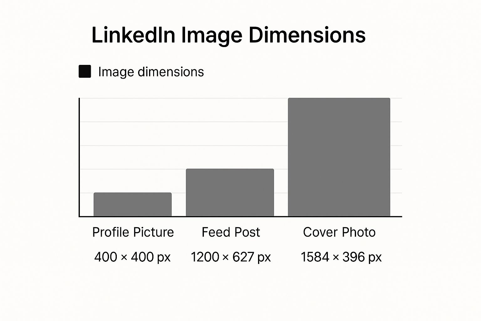
Core LinkedIn Image Dimensions
Here are the three most common image sizes you’ll be working with day-to-day:
Profile Picture:400 x 400 pixels
Feed Post (Landscape):1200 x 627 pixels
Cover Photo:1584 x 396 pixels
This infographic gives you a good visual comparison of these three key image types, so you can see how their shapes and purposes differ.
As you can see, there’s a big difference between the wide, panoramic format of a cover photo and the much more compact, square-ish profile picture and feed post images.
To make things even easier, here’s a quick reference table with the most common image sizes all in one place.
LinkedIn Image Size Reference Chart
This chart summarizes the ideal dimensions for the most critical image types on LinkedIn. Keep it handy!
Content Type
Recommended Dimensions (Pixels)
Aspect Ratio
Profile Picture
400 x 400
1:1
Personal Cover Photo
1584 x 396
4:1
Company Page Logo
300 x 300
1:1
Company Cover Photo
1128 x 191
5.9:1
Feed Post (Square)
1200 x 1200
1:1
Feed Post (Landscape)
1200 x 627
1.91:1
Link Post Image
1200 x 627
1.91:1
Carousel Post Card
1080 x 1080
1:1
Bookmark this page so you can quickly double-check your specs before you hit “post.” Getting these right is a simple way to boost your credibility and make sure your content always looks professional.
Getting Your Images Right for the LinkedIn Feed
When you post on LinkedIn, the size and shape of your image can make or break its performance. How much space your post takes up on someone’s screen, especially on a phone, is a huge deal. That’s why square and portrait images almost always beat out the traditional landscape format.
Think about it: the more screen real estate you command, the more likely you are to stop someone mid-scroll. Choosing the right format is your first step to grabbing that attention.
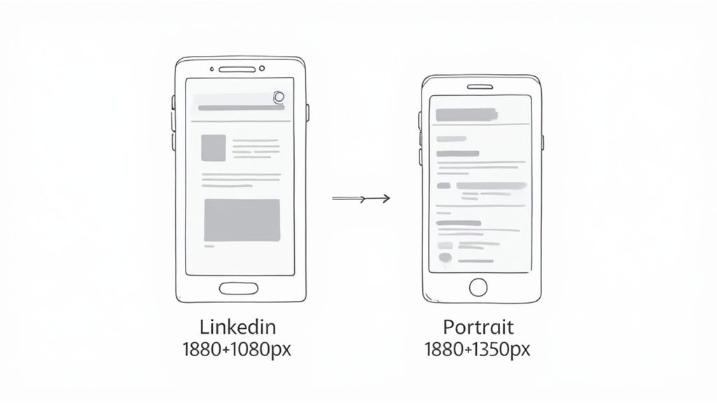
Square vs. Portrait Images
The best formats for LinkedIn feed are 1:1 (1080×1080) and 4:5 (1080×1350). Square is versatile and never crops weirdly; portrait commands more vertical space on mobile and stops the scroll more effectively.
Time and again, we see posts with square and portrait images outperform others on LinkedIn. Square gives you consistency, while portrait gives you a competitive edge on mobile where most users are scrolling.
Pro-Tip: LinkedIn technically accepts other image sizes for the feed, but if you want your visuals to look sharp and clear, stick to either 1080×1080 or 1080×1350 pixels. This prevents the platform from compressing or stretching your image in weird ways.
At the end of the day, picking the right image size for LinkedIn posts is less about following a rule and more about making a strategic choice. To take it further, learn how to improve your LinkedIn engagement with better visuals and post timing.
Nailing Your Images for Shared Links and Articles
When you drop a link into a LinkedIn post, the platform automatically pulls in a preview with a title, a short description, and an image. That little thumbnail is your first impression—and it’s often the deciding factor on whether someone clicks through. Getting that visual right is a non-negotiable for driving traffic.
According to LinkedIn’s official image guidelines, the recommended size for link preview images is 1200 × 627 pixels (1.91:1 aspect ratio). This ensures your preview looks sharp and consistent across desktop and mobile without cropping key visuals. Staying within these dimensions helps the platform render your thumbnail exactly as intended.
Taking Charge with Open Graph Tags
To control which image appears in a link preview, set the Open Graph og:image tag on your page. This tells LinkedIn exactly which image to use, preventing random, poorly suited thumbnails and keeping your preview on-brand.
Instead of letting LinkedIn grab a random, often poorly-suited image from your page, you can hand-pick the perfect visual that aligns with your content. Mastering this is a key part of learning how to post an article on LinkedIn like a pro
If you’re creating custom visuals like infographics to go with your articles, check out some of the best AI tools for LinkedIn B2B infographics. They can help you design professional graphics that are perfectly sized to grab attention.
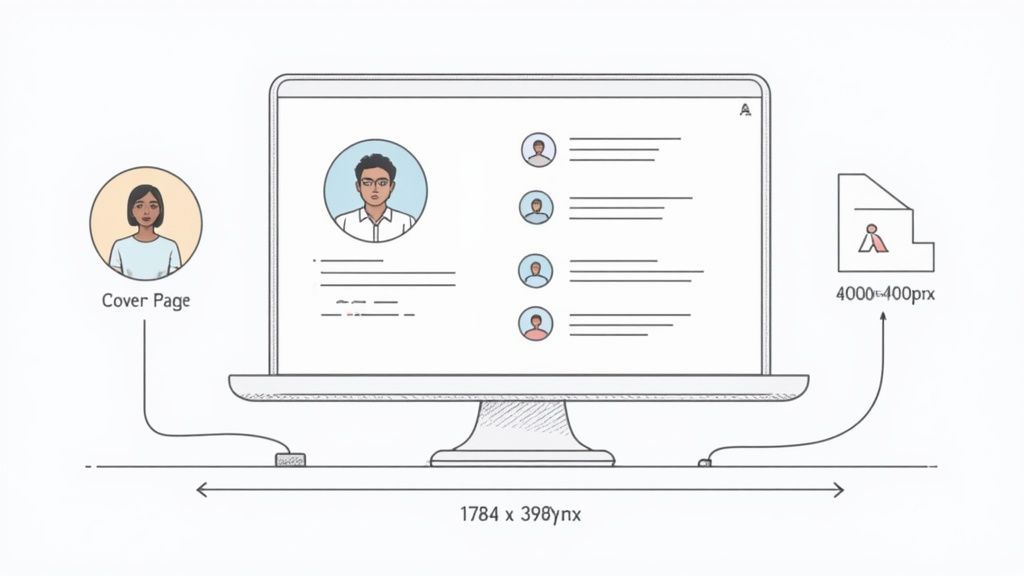
Mastering Your Profile and Company Page Images
Think of your LinkedIn profile and company page as your brand’s digital front door. The images here are the first thing people see your virtual handshake. They set the tone for potential clients, new hires, and professional connections, so getting them right is absolutely critical for building credibility.
Per LinkedIn’s Help Center, your profile photo should be between 400 × 400 px and 7680 × 4320 px, with a file size under 8 MB. Your cover photo (background banner) should be 1584 × 396 px in JPG or PNG format, also under 8 MB. Sticking to these specs ensures your visuals stay crisp on every device.
These aren’t just decorative elements; they’re foundational pieces of your professional identity. Each one has a specific job to do, whether it’s putting a face to a name or showing off your brand’s personality in a single glance.
Key Branding Image Dimensions
Let’s get straight to the numbers for the three most important branding visuals and LinkedIn post sizes that shape your professional presence.
Personal Profile Picture: Aim for 400 x 400 pixels. This is your main identifier across the platform, so make it a crisp, professional headshot. No blurry vacation photos here!
Company Page Logo: The minimum size should be 300 × 300 pixels to ensure your logo looks sharp everywhere , from search results to your followers’ feeds. Consistency here strengthens your brand recognition across every LinkedIn post size and layout.
Cover Photos (Banners): The sizes differ depending on the page. For a personal profile, the banner should be 1584 x 396 pixels. For a company page, it’s a bit smaller at 1128 x 191 pixels.
Here’s a pro tip for cover photos: always account for where your profile picture will sit. On a desktop view, your photo covers the bottom-left portion of the banner. Be careful not to place any important text, logos, or design elements in that spot, or they’ll be completely hidden.
Keeping all your visuals consistent and high-quality is a huge part of brand management.To stay organized, it helps to have a solid digital asset management workflow. This ensures your team can always find the right on-brand images, perfectly sized for every post.
Winning with LinkedIn Video and Carousel Posts
Static images get the job done, but if you really want to stop the scroll and tell a deeper story, video and carousels are where it’s at. These dynamic formats need their own set of dimensions to look sharp and give users a great experience. Getting the technical specs right is the first step to making content that genuinely connects.
When you move beyond a single image, you can show off multiple products, break down a complex topic, or just create a more engaging, interactive post. Let’s dive into the specs you need to know.
LinkedIn Video Specifications
Video is a fantastic format on LinkedIn, but it comes with more technical rules than a simple image. To sidestep any weird cropping or playback problems, stick to these guidelines:
File Size: Your video file should be between 75 KB and 200 MB.
Duration: Keep your videos between 3 seconds and 10 minutes long.
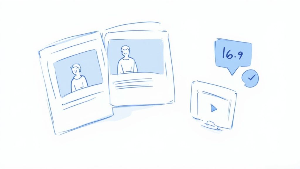
Aspect Ratio: LinkedIn is pretty flexible, supporting a range from 1:2.4 to 2.4:1. The most reliable formats are landscape (16:9) and square (1:1). For mobile-first content, vertical video (9:16) also works well — check our full guide on vertical video dimensions for the optimal setup across all platforms. For a closer look, see our guide on vertical video dimensions.
Designing Effective Carousel Posts
Carousels are essentially mini-slideshows in a single post, making them perfect for tutorials, listicles, or telling a brand story. They get users to stop and swipe through your content, which is a big win.
The real secret to a great carousel is consistency. When you use the same image size for every single card, you create a smooth, seamless swiping experience. If your cards have different dimensions, LinkedIn often slaps on a distracting gray background to fill the gaps.
For the best results, design every card in your carousel to be 1080 x 1080 pixels. That’s a perfect 1:1 square aspect ratio. This format looks clean and professional on both desktop and mobile, making your content easy to follow from the first slide to the last.
Getting Your LinkedIn Ad Images Just Right
When you’re putting money behind an ad on LinkedIn, getting the visuals right is non-negotiable. It’s about more than just looking good; it’s about making your ad spend work harder. The platform has strict guidelines for ad images, and ignoring them can lead to some seriously awkward results.
Think weird cropping, blurry logos, and a click-through rate that tanks your entire campaign. To make sure every dollar counts, you need to know the specific requirements for each ad format. Let’s dig into the details.
Single Image and Carousel Ad Sizes
Single Image Ads are the bread and butter of many LinkedIn campaigns. They’re straightforward and effective, but you have to nail the dimensions. The sweet spot is 1200 x 627 pixels, which gives you that familiar 1.91:1 rectangular aspect ratio. This size looks sharp and professional across almost every placement in the LinkedIn network.
Carousel Ads are a different beast. They let you tell a story with multiple swipeable images, but the key to a good carousel is consistency.
According to LinkedIn’s advertising specifications, each carousel card should be 1080 × 1080 px (1:1) with a maximum 10 MB file size. Keeping every card a uniform square ensures smooth transitions and prevents awkward gray padding between slides. This consistency gives your ad a more polished, professional look and boosts engagement across devices.
Recommended Resolution:1080 x 1080 pixels for each individual card.
Aspect Ratio: A perfect 1:1 ratio is a must for all cards.
File Size: Make sure each image is under 10 MB.
Keeping every card a uniform square is crucial. It stops the user’s swiping experience from feeling disjointed and makes your entire message look more polished and intentional.
Sponsored Messaging and Text Ad Dimensions
Beyond the main feed, other ad placements have their own unique image needs. If you’re using Sponsored Messaging (what used to be called InMail), you can include a banner creative right inside the message.
Sponsored Messaging Banner: The only size that works here is 300 x 250 pixels.
Then you have Text Ads, those compact ads that show up on the desktop view, usually in the right-hand column or at the top of the page. The image is small, but it’s your best shot at grabbing someone’s attention.
Text Ad Image: A simple 100 x 100 pixel square is all you need.
By mastering these different ad specs, you ensure your campaigns are optimized for every corner of LinkedIn, which ultimately boosts performance and protects your brand’s professional image.
Common Image Pitfalls and How to Sidestep Them
Getting the dimensions right is half the battle, but there are a few other common trip-ups that can make an otherwise perfect post look amateurish. We’ve all seen it: fuzzy text, weirdly cropped photos, and images that just don’t pop.
The good news is that these issues are surprisingly easy to fix. A little know-how goes a long way.
One of the biggest culprits behind blurry images? The file format. People often default to JPEG for everything, but that can be a mistake, especially for graphics. JPEGs are great for shrinking photo file sizes, but they achieve this by ditching some of the image data—what’s known as “lossy” compression. That’s fine for a photograph, but for crisp text and logos, it’s a recipe for fuzzy edges.
Choosing the Right File Format
Think of it like this: you wouldn’t use a hammer to turn a screw. You need the right tool for the job.
Use PNG for graphics with text: If your image has any text, a logo, or sharp lines, always save it as a PNG. PNG is a “lossless” format, which means it keeps all the original data, so your graphics stay sharp and clear. No weird artifacts, no blurry text.
Use JPEG for photographs: When you’re just sharing a photo, like a new headshot or an event picture, a high-quality JPEG is the way to go. You’ll get a smaller file size, which helps your page load faster, without any noticeable drop in quality.
Another classic mistake is forgetting about mobile viewers. That beautiful graphic you designed on your giant desktop monitor can easily become a squint-inducing mess on a phone screen.
Always design with a “mobile-first” approach. This means using large, clear fonts and high-contrast colors that are easy to read on a small screen. Before you hit “post,” do a quick check on your own phone. It’s the best way to catch readability problems before your entire audience does.
Got Questions About LinkedIn Image Sizes? We’ve Got Answers.
Even when you have all the correct dimensions, a few practical questions always seem to pop up. Let’s tackle some of the most common ones that people run into when getting their LinkedIn images just right.
Think of this as your quick-reference guide to solve those nagging little issues that can make or break the look of your profile and posts.
What’s the Best File Format to Use for LinkedIn Images?
This really depends on the type of image you’re uploading.
For anything with sharp lines, text, or logos, go with PNG. It keeps your graphics perfectly crisp and clear without any of that annoying blurriness. But for photos—like your headshot or pictures from an event—a high-quality JPEG is usually the better bet. It gives you a smaller file size, which helps things load faster, without sacrificing much visual quality.
Why Does My Image Look Different on Mobile vs. Desktop?
LinkedIn crops banners differently on mobile vs. desktop. Keep logos and key text centered in a safe zone so nothing gets cut off.
Should I Go Back and Update Old Posts with the New Image Sizes?
Nope, you can leave your old content as is. LinkedIn’s image specs don’t change all that often, and older posts are generally fine.
Just focus your energy on using the current, recommended dimensions for all new content you create. That’s the best way to make sure everything you publish from now on looks sharp and professional.
Ready to stop guessing and start scheduling perfect posts every time? With Postiz, you can design, schedule, and analyze your LinkedIn content all in one place. Explore how our AI-powered tools and built-in design features can streamline your workflow.
Learn why scheduling Skool posts matters for engagement and retention—and how to schedule your next Skool post from Postiz (step-by-step with screenshots).
Struggling to prove your social media value? Learn how to calculate, track, and improve your ROI social media with practical formulas, tools, and strategies.