Ever wondered what font Telegram uses? The truth is, there isn't just one. Telegram takes a really smart approach: it uses the default system font of whatever device you're on.
This makes the app feel incredibly native and integrated, whether you're on your phone or your computer.
Manage all your social media in one place with Postiz
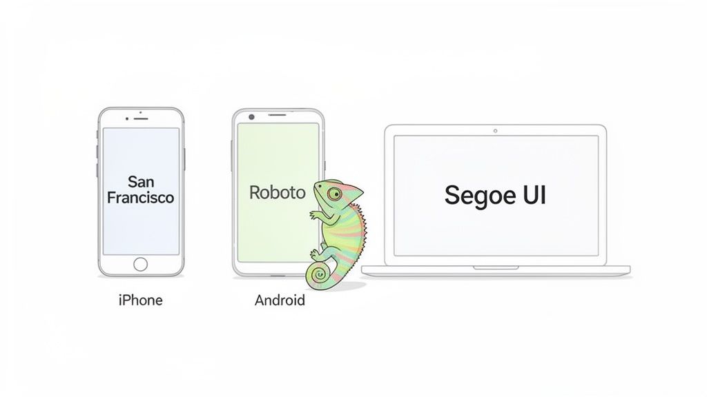
Think of Telegram's font choice like a chameleon. It perfectly adapts to its surroundings. This is a deliberate design decision, not an oversight, and it pays off in both performance and user experience. By skipping a heavy custom font, the app loads faster and feels right at home on your device from the moment you open it.
So, if you're scrolling through Telegram on an iPhone, you’re actually looking at Apple's crisp San Francisco font. Switch over to an Android phone, and you'll see Google's clean and functional Roboto typeface. This seamless integration is a huge part of what makes Telegram feel so fluid.
The same logic applies to the desktop versions. Fire up Telegram on a Windows PC, and you'll be greeted by Microsoft's familiar Segoe UI, a font designed for clarity on screens. This ensures the app feels like a natural extension of your operating system, not some clunky, out-of-place program.
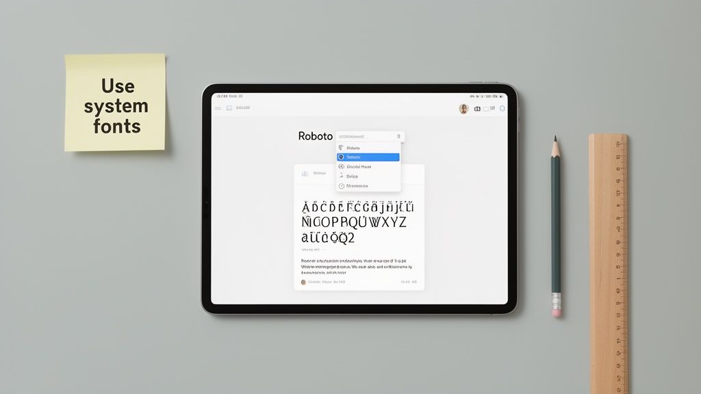
Of course, just because Telegram has defaults doesn't mean you're stuck with them. If you're looking to mix things up, you can learn more about how to change the font on Telegram.
Telegram Fonts by Operating System
To quickly see which font you're likely using, here’s a simple breakdown.
Platform
Default Font
Key Characteristic
iOS & macOS
San Francisco
Modern, clean, and highly legible on screens of all sizes.
Android
Roboto
A geometric yet friendly font with open curves.
Windows
Segoe UI
Approachable and clear with a warm, humanist feel.
Web App
System Default
Inherits the default font of your browser and OS.
This table shows how Telegram's "no-font" strategy results in a consistent, native experience everywhere.
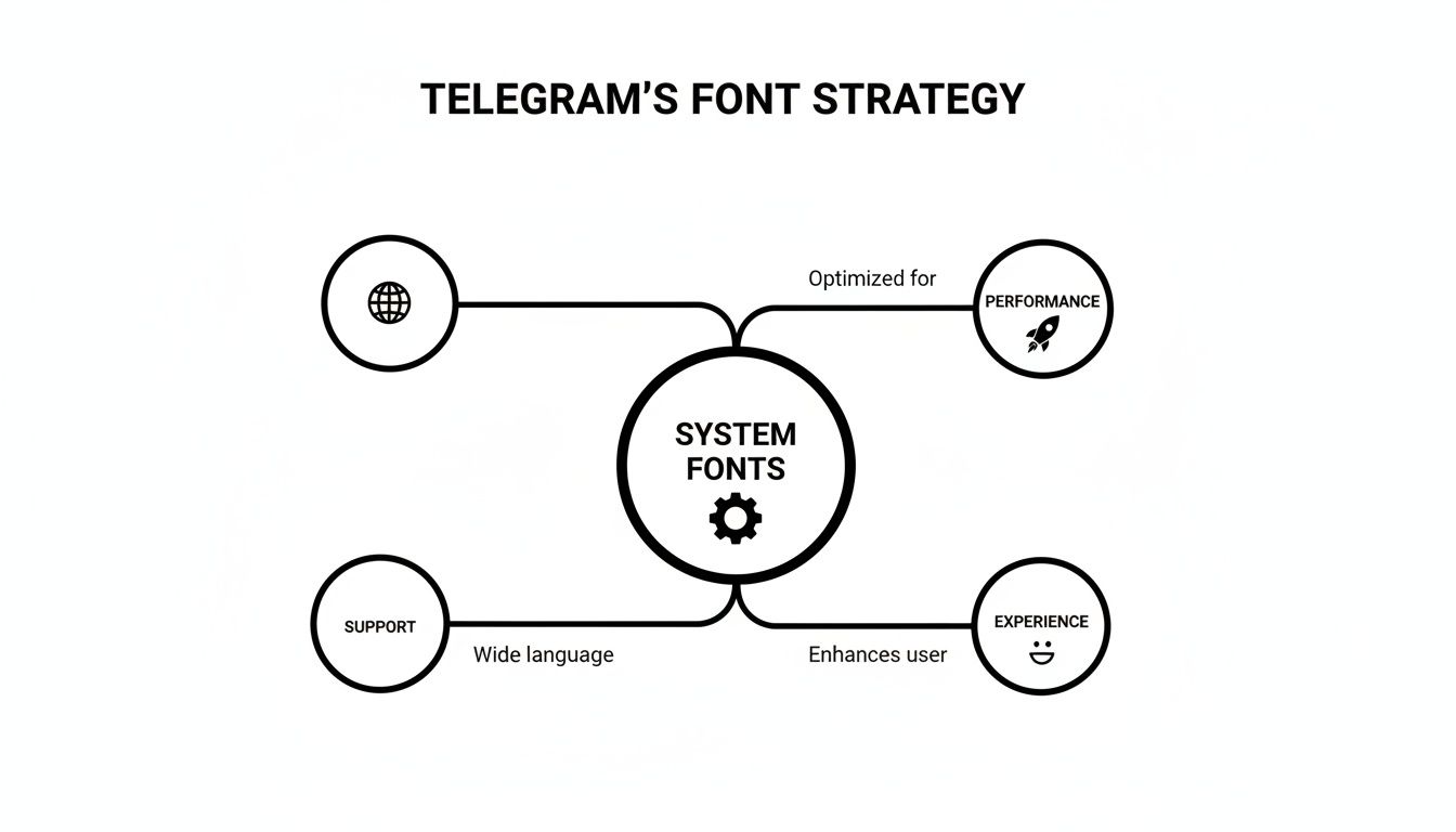
Why Telegram Uses Your Device’s Built-In Fonts
Ever notice how Telegram’s text looks a lot like the rest of your phone’s interface? That’s not a coincidence. While many apps push their own custom fonts, Telegram made a smart decision to stick with the native fonts already built into your device.
Think of it this way: loading a custom font is like asking a web browser to download a huge video file before you can see the page. It slows things down. By using the fonts that are already on your phone or computer, Telegram keeps the app feeling snappy, lightweight, and fast.
This approach makes the app feel like a natural extension of your device, not some clunky, third-party software. It’s a subtle choice, but it has a massive impact on the user experience.
All About Speed and Accessibility
Using your device's native fonts gives Telegram a few key advantages that a custom font just can't offer. This decision directly affects how the app performs and, more importantly, how easy it is for everyone to use.
Here’s what that means for you:
No Waiting Around: The app doesn’t have to download extra font files, so it launches faster and your chats load instantly.
Less Data Eaten Up: If you’re on a limited mobile plan, you’ll be glad to know you aren’t wasting precious data downloading font packs.
Works With Your Settings: System fonts are designed to integrate perfectly with accessibility features, like making the text bigger if you have trouble seeing small print.
A core principle of good design is to meet people where they are. By using system fonts, Telegram feels immediately familiar and readable, which makes it easier for a massive, global audience to use without a second thought.
Ready for a Worldwide Audience
The most important reason for this choice might just be language support. Designing a single custom font that correctly displays characters from dozens of scripts—from Cyrillic to Japanese—is an enormous challenge. System fonts, on the other hand, are already built to handle a huge range of languages right out of the box.
This became absolutely critical as Telegram exploded in popularity. After launching in 2013, the app grew to an incredible 900 million monthly active users. You can read more about Telegram's incredible growth story) on Wikipedia. This strategy ensures that no matter what language you're typing in, your messages will always look clear and correct.
A Closer Look at Typography on Each Platform
If you've ever noticed that Telegram just feels right on your device, you’re not imagining things. It’s a deliberate design choice. Instead of forcing a single, custom font on everyone, the app cleverly defaults to the native typography of whatever operating system you're using.
This approach is key to Telegram's snappy, seamless feel. The text looks exactly as it should, whether you're on an iPhone, an Android tablet, or a Windows PC. It feels familiar because it is familiar.
Fonts on Apple, Android, and Windows
On any Apple device—iPhone, iPad, or MacBook—Telegram displays all text in San Francisco. This is Apple’s own creation, a modern sans-serif designed obsessively for clarity. The spacing and weighting are fine-tuned to stay perfectly legible, from a tiny watch notification to a lengthy message on a big iMac screen.
Hop over to an Android phone, and you’ll be reading everything in Roboto. Google famously described this font as having a “dual nature,” mixing a mechanical structure with friendly, open curves. It strikes a great balance between being professional and approachable, making it a perfect match for the Material Design language.
For anyone using Telegram on a Windows computer, the interface and all your chats will appear in Segoe UI. As Microsoft’s flagship font, this humanist sans-serif is known for its clean and friendly feel. It was specifically engineered for better on-screen reading, so it’s a natural choice for a chat app.
The diagram below shows how this isn't just a happy accident—it's a core strategy.
Relying on system fonts makes the app faster, more accessible, and instantly intuitive for users. The small details really matter in typography, and you can see how things like Kerning, Leading, and Tracking in Typography Design contribute to a polished final product.
By aligning with your device’s native typography, Telegram makes its content feel completely integrated and trustworthy. For creators, this is a huge plus. Your messages and posts automatically look professional and "at home" to your audience, no extra design work needed.
Understanding which fonts are used on each platform can be a game-changer for creators who want their graphics and other content to blend in perfectly. And if you're looking to stand out with some stylized text in your bio or channel posts, you can play around with a https://postiz.com/tools/telegram-font-generator to get some creative effects.
The One Time Telegram Went Its Own Way
While Telegram’s current reliance on system fonts is a smart, user-first strategy, there was a fascinating time when they tried something completely different. For a while, the Telegram Desktop app actually broke the mold and used its own custom font: the well-known Open Sans.
At first glance, it seemed like a solid choice. Open Sans is clean, modern, and practically everywhere on the web, so you'd think it would be a safe bet. But this experiment quickly became a live lesson in just how tricky typography can be when you’re building for a global audience. The decision kicked off a huge debate in the community and exposed some major weaknesses in the one-font-fits-all approach.
Why a Single Font Didn't Work
Almost right away, users started flagging problems that were getting in the way of the app's famously smooth experience. Two big issues kept popping up, proving why a single font just can't serve a platform as diverse as Telegram.
Clumsy Letter Spacing: A lot of people pointed out that the spacing between letters—what designers call kerning—just felt wrong. It made text look a bit sloppy and was a step down from the crispness of the native system fonts they were used to.
Massive Gaps in Language Support: This was the real deal-breaker. Open Sans just couldn't handle many non-Latin languages, effectively leaving a huge chunk of Telegram’s international users with broken or unreadable text.
This real-world test perfectly illustrates why they ultimately switched back to system fonts. The version of Open Sans the app was using only had 938 glyphs (which are all the individual characters, symbols, and punctuation marks). That’s nowhere near enough for a global messaging app. System fonts, by comparison, often support thousands of glyphs, making sure everyone's messages show up just right. If you're curious, you can see the original user feedback yourself in the community discussion about these font issues.
In the end, this chapter of Telegram's history is a great case study. It proves that for an app with users all over the world, things like broad language support and flawless readability aren't just nice-to-haves. They're the absolute bedrock of a good, inclusive user experience.
How to Use Telegram Fonts in Your Own Designs
Want to create graphics or videos for your Telegram channel that look like they truly belong? The secret is surprisingly simple: use the same fonts that Telegram itself uses on each platform.
When your content’s typography matches the app’s interface, it feels native and professional. This subtle touch makes your brand feel more credible and seamlessly integrated into your audience's daily scrolling.
The good news is you don’t have to go on a digital scavenger hunt. These fonts are generally easy to find and use in your favorite design tools.
For Android (Roboto): You're in luck! Roboto is a Google Font, which means it’s completely free to download and use in tools like Canva, Figma, or the Adobe suite.
For Windows (Segoe UI): This one comes pre-installed on every Windows machine. It's readily available in your design software, but it's wise to double-check the licensing terms if you're using it for commercial projects.
For Apple (San Francisco): Apple makes this font available to developers building for its platforms. Its usage is a bit more restricted, so it's perfect for mockups or designs specifically meant for iPhones, iPads, or Macs.
Matching the Native Look
Just picking the right font family is step one. To truly nail the native feel, you have to pay attention to the little details like font weights and sizes.
Think about how Telegram itself does it. Headlines are typically bolder, while the main message text is a standard, regular weight. Mimicking this hierarchy in your own designs makes a huge difference.
By mirroring Telegram's typographic style, you create a visual shortcut for your audience. Your content immediately feels familiar and trustworthy, which is a subtle but powerful way to build a stronger connection with your community.
Thinking about fonts is a great first step in building a consistent look for your channel. To take it further, you might find this free brand style guide template useful for organizing all your visual elements. And if you're looking to add some flair to your profile itself, our Telegram bio generator can give you some fun, stylized options.
Answering Your Top Questions About Telegram Fonts
Alright, let's wrap this up by tackling some of the most common questions we see about Telegram's typography. These are the little details that often pop up once you start digging in.
Can I Change the Font Inside My Telegram App?
In short, no. The official Telegram app doesn't have a built-in feature to swap out the interface font. This is actually a deliberate design choice. By sticking to your device's native font, the app feels incredibly fast, familiar, and perfectly integrated with your phone or computer.
You might stumble upon third-party, unofficial Telegram clients that offer font customization. A word of caution, though: these apps aren't supported by Telegram and could introduce security risks. It's almost always safer to stick with the official version.
What Font Does Telegram Use for Its Logo?
That's a different beast entirely. The font you see in the Telegram logo and other branding materials is a custom typeface made just for them. It has nothing to do with the fonts used inside the app for your chats and menus.
Think of it this way: the logo font is designed to be unique and memorable, building the brand's identity. The in-app fonts like San Francisco and Roboto are chosen for pure function—their job is to be so clear and readable that you don't even think about them.
This is a classic branding play. The logo font needs to stand out and say "This is Telegram." The interface font needs to get out of the way so you can read your messages.
Do the Telegram Web Apps Use My System Font?
Yep, they sure do. Both Telegram WebK and WebZ are built to use whatever default font your web browser is set to. And nine times out of ten, your browser is just using your computer's default operating system font.
So, if you open Telegram in Chrome on your Windows machine, you'll see Segoe UI. This keeps the web experience feeling right at home alongside all your other desktop apps.
Are These Fonts Free to Use for My Own Projects?
This is where it gets a little tricky, as the answer is a mix of yes and no. It completely depends on which font you're eyeing for your own designs.
Roboto (Android): Go for it! This font is totally free and open-source. You can grab it from Google Fonts and use it for pretty much any personal or commercial project without worry.
San Francisco (iOS/macOS): This one's more restricted. Apple provides it to developers specifically for designing and building apps for its ecosystem. You can't just download it and use it freely for general commercial work.
Segoe UI (Windows): This is a proprietary font owned by Microsoft. It's bundled with Windows, but if you want to use it in commercial designs, you’ll need to double-check the specific licensing terms to stay on the right side of the rules.
Ready to streamline your social media workflow? Postiz offers a powerful open-source platform to schedule posts, generate content with AI, and analyze your performance. Take control of your social media today