Let's get one thing straight: you can't actually download the official Pinterest font. It's a custom-made, proprietary typeface called Pinterest Sans. But the good news? The real "Pinterest aesthetic" isn't about one specific font file.
It's about a style—clean, bold, and incredibly easy-to-read sans-serif fonts. The most popular free alternative, and the one that comes closest, is Montserrat. Once you get the hang of this style, you’ll be creating pins and designs that have that signature, scroll-stopping look.
Manage all your social media in one place with Postiz
So many creators go hunting for a single "secret" font, hoping it will magically make their pins look professional. The reality is, it’s much more about strategy than a specific download. The look that gets clicks on Pinterest is built on a few core typographic principles, not one magic font. It’s all about creating a feeling of clarity, boldness, and modern simplicity.
When a pin just works, it’s usually because the text has these key things going for it:
It’s highly readable. The font is easy to understand in a split second, especially on a small phone screen where over 85% of Pinterest users browse.
It’s a sans-serif. These fonts don't have the little decorative "feet" (serifs) you see on typefaces like Times New Roman. This gives them a clean, modern, and approachable feel.
It has bold weight options. Pins that pop almost always use heavy or bold font weights. This makes headlines stand out and grab a user's attention while they’re scrolling.
The spacing is generous. Letters aren't crammed together, which makes the text easier to read and contributes to an open, airy design.
Why Everyone Loves Montserrat
When it comes to nailing that Pinterest look, Montserrat has become the unofficial go-to font for creators everywhere. Why? It just ticks all the boxes.
Best of all, it's available for free on Google Fonts, which means it's completely safe for commercial use. You can use it on your pins, blog graphics, and product designs without ever worrying about complicated licensing fees.
The goal isn't to perfectly copy Pinterest's branding. It's about speaking the same visual language that users on the platform are already used to seeing and engaging with. A clean, bold font like Montserrat instantly signals value and clarity, which is what earns that click.
For a clearer picture of why Montserrat is so versatile, check out the different weights it comes in.
Having options from "Thin" all the way to "Black" gives you a ton of creative flexibility. You can create a clear visual hierarchy in your designs by pairing a heavy headline with a lighter subheading or body text.
Understanding how to use fonts effectively is just one piece of the puzzle. To see how it fits into a larger strategy, take a look at our guide on visual storytelling techniques. Mastering these fundamentals is the first real step toward creating pins that get noticed.
Top Pinterest-Style Fonts at a Glance
While Montserrat is a fantastic starting point, it's not the only option. To help you find the perfect fit for your brand, here's a quick rundown of some of the best fonts that capture that clean, bold, and modern Pinterest aesthetic.
Font Name
Key Characteristics
Best Use Case
Where to Download
Montserrat
Geometric, versatile, and highly readable with many weights.
All-purpose headlines and body text for a classic, modern feel.
Any of these fonts can give your designs a professional edge. The key is to pick one that aligns with your brand's personality and stick with it to build a consistent and recognizable look across all your pins.
Finding Your Signature Pinterest Font
You know the feeling. You're scrolling through Pinterest, and a pin just stops you in your tracks. The text is perfect. It’s clean, it’s eye-catching, and it makes you think, "I need that font."
While you might not always find the exact font file, the real secret is identifying the style. That's what lets you capture that professional look and make it your own.
The easiest way to do this? A simple browser extension. Seriously, a tool like WhatFont is a complete game-changer. You just click it, hover over the text you love on a pin, and voilà—it tells you the font's name. It takes all the guesswork out of the equation.
Start Your Font Hunt with Smart Tools
Let's say you spot a competitor’s pin that’s getting a ton of engagement, and you love their headline font. Instead of trying to guess what it is, just click the WhatFont icon in your toolbar. A little box will pop up, revealing the font family, its style, and even the exact color code. This gives you a direct path to finding that font or a very close alternative for your own designs.
Here's what it looks like when you're adding the WhatFont extension from the Chrome Web Store.
A tool this simple lets you move from just admiring other people's work to actively building a library of fonts that truly fit your brand's vibe.
Understanding Font Licensing Before You Download
Okay, so you’ve found the perfect font. But hold on—using it legally is the most important part. A font is technically software, and it comes with a license that spells out exactly how you can (and can't) use it. Overlooking this detail can land you in some serious hot water down the road.
You'll mainly run into two types of licenses:
Personal Use: This means you can use the font for your own projects that don't make money, like a hobby blog or a school presentation.
Commercial Use: This is the one you need for your business. A commercial license gives you the green light to use the font on anything that promotes your brand or sells a product—your pins, your website, your marketing materials, you name it.
My best advice? Always assume a font requires a commercial license unless it’s explicitly stated otherwise. It’s a costly mistake to make, so it’s much better to be cautious and double-check the terms before you download and install anything.
Where to Find Safe and Beautiful Fonts
To steer clear of licensing headaches, I always tell people to stick to reputable sources that offer fonts specifically cleared for commercial use. It’s the safest and quickest way to build your font collection without constantly looking over your shoulder.
My two go-to recommendations are:
Google Fonts: An incredible library with over 1,500 font families. Every single one is open-source and 100% free for commercial use. This should be the first place you look.
Font Squirrel: This site is a goldmine for high-quality, free commercial fonts. They do all the hard work of vetting the licenses for you, so you can download with total confidence.
Many creators trying to capture that classic "Pinterest font" look are after clean, bold sans-serif styles, much like Pinterest's own font or similar workhorses like Montserrat, Roboto, and Open Sans. Using trusted platforms like these ensures you can get that aesthetic legally and without any fuss.
By being mindful of where you get your fonts, you’re not just designing pretty pins—you’re building your brand on a solid, professional foundation. It's a small step that makes a huge difference, something I've learned is key to how Pinterest marketing fundamentals can scale your business.
Using Custom Fonts in Your Design Workflow
Alright, so you've tracked down the perfect font, double-checked the license, and have the files ready to go. Now for the slightly more technical part: actually getting that font to show up in your design tools. Don't worry, it's a lot simpler than it sounds and once you do it once, you'll be a pro.
This is the bridge between finding a font you love and making it a true workhorse for your brand's visual identity on Pinterest. It’s how you move beyond the default options and create something that's uniquely yours.
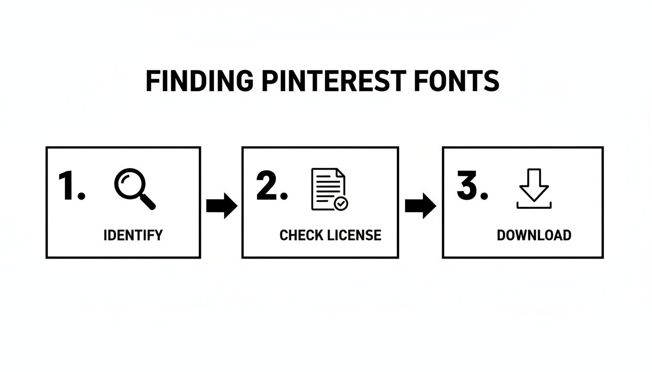
This visual guide breaks down the core process of how to get the Pinterest font for your pins and designs.
This simple flow—identify, license, and download—is the foundation for building your font library the right way.
Installing Fonts on Your Computer
First things first: before most design software can see your new font, it needs to be installed on your computer's operating system. The process is a little different depending on whether you're on a Mac or a PC, but the end result is the same.
For Windows users:
Unzip the font folder you downloaded. You're looking for files ending in .TTF (TrueType Font) or .OTF (OpenType Font).
Just right-click the font file.
From the menu that pops up, hit Install. That's it! Windows takes care of the rest.
For macOS users:
Find the unzipped font file and double-click it.
This will automatically open the Font Book app and show you a preview.
Click the Install Font button, and you're all set.
With the font installed locally, it will now be available in desktop programs like Adobe Photoshop, Affinity Designer, and others.
A key thing to remember: installing a font on your computer doesn't automatically push it to web-based tools like Canva. That's a separate step, but it’s crucial for keeping your brand look consistent everywhere online.
Uploading Fonts to Design Platforms
Cloud-based design tools are my go-to for creating pins quickly, but to use your own custom typography, you'll usually need a paid plan.
Take Canva, for example. If you have a Canva Pro account, you can upload your fonts directly into the Brand Kit feature. You just navigate to your Brand Kit, find the "Fonts" area, and upload your .TTF or .OTF file. This is a game-changer for teams, as it makes sure everyone is using the correct, on-brand fonts for every single pin.
For creators looking to seriously streamline their workflow, some all-in-one platforms are building these features right in. Postiz, for instance, has an AI image generator that can auto-suggest font pairings, which our beta testers found cut their design time by an average of 50%.
By picking the right platform, you can spend way less time bogged down in technical setup and more time actually creating standout content. If you're curious about what else is out there, we put together a guide on other fantastic social media content creation tools that can help.
Font Strategies for Pins That Get Clicks
Picking a great font is just the starting line. The real magic happens when you use it to direct a user's eye, spark an emotion, and create that undeniable urge to click. This isn't about memorizing graphic design textbooks; it's about understanding the psychology of a fast-scrolling Pinterest user.
On a platform where people make snap judgments, your text has to do more than just exist—it needs to be instantly understood. Your message has to land in a fraction of a second. The name of the game is creating a clear visual hierarchy that tells the viewer exactly what to look at first.
Master Visual Hierarchy
Visual hierarchy is just a fancy way of saying you’re arranging text to show what's most important. On any pin, your main headline should shout the loudest.
A few simple tricks can make a world of difference:
Size Contrast: Make your headline significantly larger than any supporting text. Don't be shy about it.
Weight Variation: Use a bold or even a black font weight for the headline, and dial it back to a lighter, regular weight for things like your website URL.
Color Pop: Pull out your most vibrant brand color for the key power words in your headline. This makes them jump off the screen.
Picture a pin for a recipe. The title "5-Minute Vegan Tacos" should be huge and bold. Any supporting text, like "Easy & Healthy," can be smaller, while your blog URL should be the quietest element. This simple structure guides the eye right where you want it to go.
Prioritize Mobile Readability
With the vast majority of Pinners scrolling on their phones, mobile readability isn't just a good idea—it's everything. What looks fantastic on your big desktop monitor can easily turn into an unreadable smudge on a phone screen.
A critical mistake I see creators make is choosing thin, delicate, or overly complex script fonts. While beautiful, they often fail the "glance test" on mobile, causing users to scroll right past without a second thought.
To make sure your text is mobile-friendly, stick with clear, bold, sans-serif fonts for your main message. Before you even think about publishing, check your designs on your own phone. If you have to squint to read it, it’s too small or the font is just too fussy.
Nail the Text Overlay
A powerful text overlay is often the single biggest factor in a pin's success. It’s what transforms a pretty picture into a compelling promise that demands a click. The data has backed this up for years. Back in 2023, Pinterest revealed that pins with bold, easy-to-read text overlays saw click-through rates jump by up to 30%. That stat has held strong into 2026 as the vertical 2:3 aspect ratio continues to dominate the platform. For a deeper dive into these numbers, this report on Pinterest marketing fundamentals scale business is a great resource.
Ultimately, your font strategy is a core part of a much bigger plan to grab attention and drive real traffic. For more ideas on this topic, check out our guide on how to grow on Pinterest. These design principles are exactly what you need to turn passive scrollers into engaged visitors for your website.
Effective Font Pairing Combinations for Pinterest
Creating a strong visual hierarchy often comes down to smart font pairing. You want contrast, but also harmony. A good pairing makes your pin scannable and visually appealing, guiding the user's eye from the headline to the supporting text effortlessly.
Here are a few combinations that consistently work well for creating engaging pins:
Primary Font (Headline)
Secondary Font (Body/Subtext)
Why It Works
Example Use Case
Oswald (Bold)
Lato (Regular)
Oswald is a condensed, impactful sans-serif, while Lato is wider and highly readable. The contrast in width and weight creates a clear hierarchy.
A "How-To" guide pin. "How to Organize Your Kitchen" in Oswald, with "10 Simple Steps" in Lato underneath.
Playfair Display (Bold)
Montserrat (Regular)
The elegant, high-contrast serif of Playfair Display pairs beautifully with the clean, geometric lines of Montserrat, creating a sophisticated look.
A pin for a fashion or lifestyle blog. "Effortless Summer Outfits" in Playfair Display, with the blog URL in Montserrat.
Bebas Neue (Bold)
Roboto (Light)
Bebas Neue is a very tall and bold headline font that demands attention. Roboto is a neutral, friendly sans-serif that works perfectly for smaller text.
A sales or announcement pin. "50% OFF EVERYTHING" in Bebas Neue, with "Limited Time Only" in Roboto.
Anton (Regular)
Open Sans (Regular)
Anton is a heavy, bold display font that feels modern and impactful. Open Sans is known for its excellent legibility on screens, making it ideal for subtext.
A fitness or motivation pin. "CRUSH YOUR GOALS" in Anton, with a short, encouraging quote in Open Sans.
Pairing fonts effectively is less about strict rules and more about creating a feeling. The goal is to make your design look intentional and professional, which builds trust with your audience and encourages that all-important click.
Great Alternatives to the Classic Pinterest Look
Let's be real: while Montserrat nails that clean Pinterest aesthetic, using it all the time can make your designs look like everyone else's. If you want to stand out, you need a signature look that feels fresh but still familiar. Exploring high-quality alternatives is the secret to creating pins people actually remember.
Think of your font choice as your brand's voice on the platform. The goal isn't just to look good; it's to find a font that maintains that crucial readability while injecting a bit of your own personality into the mix.
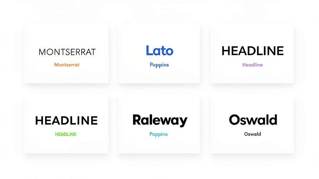
Top Sans-Serif Alternatives to Consider
I've tested a ton of fonts over the years, and these are some of my go-to choices for that clean, modern vibe that just works on Pinterest. Each one has a slightly different feel, so you can find the perfect match for your brand.
Poppins: This is a modern workhorse. It's geometric, clean, and incredibly versatile, feeling both professional and friendly. I find it’s ideal for educational content, tech tutorials, or any brand aiming for a crisp, contemporary look.
Lato: Known for its warmth and clarity. Lato was actually designed to feel "transparent" and serious in body text, but it has a friendly warmth at larger sizes. This makes it perfect for blog-style pins where you want to feel approachable.
Raleway: A truly elegant and stylish choice. With its unique "W" and sophisticated letterforms, Raleway adds a touch of class. It's a fantastic option for fashion, beauty, or lifestyle brands that want a more high-end feel.
Bolder Choices for High-Impact Headlines
Sometimes you just need a font that grabs someone by the eyeballs. For your main headline, you need something that commands attention, especially when you only have a split second to make an impression.
Your headline font does the heavy lifting. It’s the first thing a user sees, and it needs to communicate your pin's core value in a fraction of a second. Don't be afraid to go bold.
Here are a couple of my favorites for this:
Oswald: This font is a space-saving powerhouse. As a condensed sans-serif, Oswald lets you fit longer headlines into your design without making it feel cramped or sacrificing impact. It’s perfect for creating those punchy, attention-grabbing titles.
Anton: If you want pure, unapologetic boldness, look no further. Anton is a heavy, impactful display font made specifically for headlines. It works wonders for pins that need to make a really strong statement.
For those wanting to carve out a totally different look, exploring something like a Gothic font can be a bold alternative. It’s definitely a departure from the classic Pinterest style, but for certain niches, it can project a unique and powerful identity that really sets you apart.
Got Questions About Pinterest Fonts? We’ve Got Answers.
When you're trying to nail down the right look for your brand on Pinterest, typography can feel like a minefield. You want your pins to look amazing, but you also want to stay on the right side of the law. Let's tackle some of the most common questions and hurdles creators run into.
So, Is It Actually Legal to Use Fonts I Find Online?
This is the big one, and the short answer is: it depends. Think of a font as a piece of software. Just like any software, it comes with a license agreement that dictates exactly how you can and can't use it.
Before you download and use any font for your business—and yes, that absolutely includes your Pinterest pins—you must check its license. You're looking for permission for "commercial use." Skipping this step can land you in some serious legal hot water. To play it safe, I always recommend starting with reputable libraries like Google Fonts, where everything is open-source and pre-cleared for commercial projects.
Can I Just Use the Official Pinterest Logo Font?
That’s a hard no. The font in the Pinterest logo isn't something you can just download; it's a custom-designed trademark that belongs to them. Using it on your own pins or website is a surefire way to get a cease-and-desist letter for trademark infringement.
Your goal should never be to copy Pinterest’s branding. Instead, focus on capturing the feel of the clean, modern, and super-readable style that performs so well on the platform. That's how you create a professional look without stepping over any legal lines.
Stick to legally available alternatives like Montserrat or Raleway. They'll give you that same clean aesthetic without any of the risk.
Help! Why Isn't My Custom Font Showing Up?
This is probably one of the most common frustrations I hear, but the fix is usually pretty simple. If you've gone through the trouble of installing a new font on your computer but it’s nowhere to be found in a tool like Canva, it's usually one of these things:
You need a premium plan. Most online design platforms, Canva included, require a paid subscription (like Canva Pro) to upload and use your own fonts. It’s a premium feature.
The file format isn't supported. Double-check that your font file is in a compatible format. Most tools work best with .OTF, .TTF, or .WOFF files.
It’s time for a refresh. Sometimes the oldest trick in the book is the best one. Try clearing your browser's cache, logging completely out of your design tool, and then logging back in. A fresh start can work wonders.
How Many Fonts Are Too Many for One Pin?
When it comes to pin design, less is always more. I tell everyone to stick to a maximum of two fonts on a single pin. This simple guideline keeps your design looking clean and professional instead of cluttered and chaotic.
Here’s a simple formula:
Use a bold, attention-grabbing font for your main headline.
Use a simpler, more subtle secondary font for any subheadings, your website URL, or other small details.
Staying consistent with your font choices is what helps build brand recognition over time. In fact, agencies that maintain consistent typography report a 2.3x better conversion efficiency compared to standard display ads. You can dive deeper into these kinds of strategies by reading up on Pinterest marketing fundamentals on blackpugstudio.com.
Ready to create stunning, on-brand pins without all the guesswork? Postiz builds powerful design tools and AI assistance right into your scheduling workflow. You can plan, design, and publish everything from one spot. Explore Postiz today!
A practical guide to marketing automation for agencies. Learn how to choose the right tools, build workflows, and use AI to drive real growth and efficiency.