If you want your LinkedIn posts to look clean, sharp, and professional, image size really matters. One of the safest and most reliable options for standard feed posts is a 1200 × 1200 pixel square image. This 1:1 format displays consistently across desktop and mobile and helps you avoid awkward cropping or blurry visuals.
But LinkedIn isn’t just one feed with one image size. Different placements such as link previews, profile banners, company pages, and carousels all use different dimensions and aspect ratios. Using the wrong size can lead to cropped text, stretched logos, or visuals that simply don’t look intentional.
To make things easier, this guide breaks down the most important LinkedIn image sizes, explains when to use each one, and helps you choose formats that look good and perform well.
Manage all your social media in one place with Postiz
Getting your visuals right is a huge part of making a strong impression on a professional network like LinkedIn. Every piece of visual content, from a simple feed post to a company page banner, has its own set of ideal dimensions. If you use the wrong size, you risk your images looking blurry, having key information cut off, or just giving off an unprofessional vibe that weakens your message.
This guide gives you a quick, scannable overview of the most important dimensions you’ll need to know.
LinkedIn Image Size Cheat Sheet
Here’s a handy table to keep all the essential numbers in one place. Bookmark this for a quick reference whenever you’re creating new visuals.
Image Type
Recommended Dimensions (Pixels)
Aspect Ratio
Single Image Post (Feed)
1200 x 1200
1:1
Link Preview Image
1200 x 627
1.91:1
Carousel Post (Single Image)
1080 x 1080
1:1
Personal Profile Banner
1584 x 396
4:1
Company Page Banner
1128 x 191
5.9:1
This cheat sheet covers the most common formats, but let’s dive into a bit more detail for feed posts.
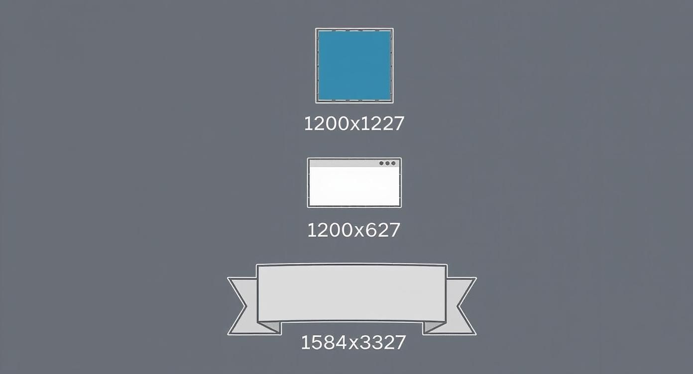
A Closer Look at Feed Images
The infographic below breaks down the key image sizes for different types of LinkedIn content, focusing on what you’ll see most often in the feed.
As you can see, LinkedIn really prefers a square 1:1 aspect ratio for standard feed posts. However, it switches things up for other placements.
For instance, images that appear in link previews look best at a 1.91:1 ratio, which is more of a wide rectangle. On the other hand, your personal profile banner uses a very wide 4:1 format to stretch across the top of your page. You can learn more about how LinkedIn optimizes different ratios directly from their platform guidelines.
Why Bother with LinkedIn Image Sizes?
Let’s be honest, getting image sizes right for any social media platform can feel like a chore. But on LinkedIn, it’s not just about aesthetics; it’s about your professional credibility. If you upload an image that’s the wrong size, LinkedIn’s system will try to “fix” it for you by automatically cropping, stretching, or squashing it.
The result? Your carefully designed visual gets butchered. Key information might be lopped off, your logo could look distorted, and the whole post just screams “unprofessional.” This little detail can instantly undermine the message you’re trying to send.
It’s All About Engagement and a Polished Look
Think about it: a crisp, perfectly formatted image looks sharp and intentional. It builds a polished brand identity, which is everything on a network like LinkedIn. Posts with correctly sized images are simply more attractive and easier to look at, which naturally leads to more likes, comments, and shares.
LinkedIn’s algorithm is designed to promote content that gives users a good experience. A post with a clean, well-sized image signals quality, which can help the platform show your content to a wider audience. Taking a minute to get the dimensions right is a small investment that pays off big in visibility and perception.
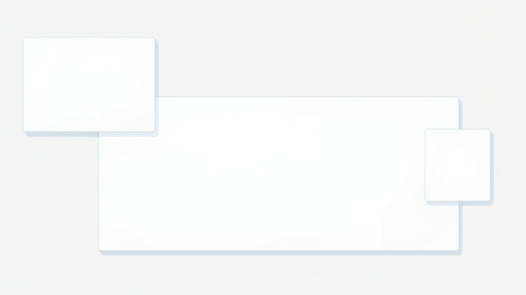
Sizing Images for Your LinkedIn Feed Posts
The LinkedIn feed is a busy place. To stop the scroll and get people to notice your content, getting your image sizes right is non-negotiable. When you’re sharing a single image, you’ve got a couple of solid options, and choosing the right one really depends on what you want to achieve.
Single Image Post Dimensions
The aspect ratio you pick dictates how much screen space your post commands, which is especially critical on mobile.
Square (1:1 Aspect Ratio): The go-to size here is 1200 x 1200 pixels. This is probably the most reliable format because it looks great everywhere—desktop, mobile, you name it. It won’t get awkwardly cropped, making it perfect for a clean, professional look.
Portrait (4:5 Aspect Ratio): To really make an impact on mobile, aim for 1080 x 1350 pixels. This taller format simply takes up more of the screen, forcing people to pause as they scroll. It’s a fantastic choice for things like detailed infographics or powerful portrait shots that need room to breathe.
You can post wider landscape images, but honestly, they tend to get squished in the feed and don’t have the same stopping power as their square or portrait counterparts.
Multi-Image Posts and Tech Specs
Thinking about posting a few images at once? LinkedIn will automatically whip them up into a collage for you. Just remember, the very first image you upload gets the spotlight, so make sure it’s your strongest one.
As for the technical nitty-gritty, LinkedIn has some rules to keep things running smoothly.
Your image aspect ratio needs to be somewhere between 3:1 and 4:5.
The minimum width is 552 pixels, but for crisp, clear visuals, you should really be aiming for at least 1080 pixels wide.
Keep your file size under 5MB. Anything bigger can lead to slow load times, which is a surefire way to lose your audience’s interest. For a deeper dive, you can explore more social media image guidelines to keep your visuals sharp across all platforms.
Pro Tip: When you’re building a post with multiple images, try to make that first, most prominent image a 4:5 portrait. This trick helps anchor the collage and gives the whole post a more intentional, polished look in the feed.
Getting Your Profile and Company Page Images Right
Your personal profile and company page are the foundations of your presence on LinkedIn. Think of them as your digital handshake or storefront. Getting the visual elements just right isn’t just about aesthetics; it’s about making a sharp, professional first impression that builds credibility from the get-go.
From your profile photo to your company banner, every image has a specific size. Sticking to these dimensions means no awkward crops or blurry pictures—just a clean, polished look that shows you pay attention to the details.
Personal Profile Image Sizes
Your profile picture is often the first thing people see. It follows you everywhere—in search results, when you comment, and on every post you share. It’s your personal brand’s logo.
Profile Picture: The sweet spot is 400 x 400 pixels. You can go smaller, but sticking to this size keeps your photo crisp and clear, no matter where it shows up.
Background Banner: Use an image that’s 1584 x 396 pixels. This is a great space to express your professional personality, highlight what you do, or even add a call to action.
Company and Showcase Page Dimensions
For any business, a strong, consistent brand look is non-negotiable. Your company page images are what make your brand instantly recognizable to your audience and potential clients.
Company Logo: The recommended size is 400 x 400 pixels. This is the square logo that appears next to all your posts and on the profiles of your employees.
Cover Image: Your main banner should be 1128 x 191 pixels. This is prime real estate to show off your brand’s character and message.
Think of a well-optimized page as a visual anchor. It makes everything you share more memorable and professional. This solid foundation is crucial for all your content, and it’s just as important when you’re figuring out how to post an article on LinkedIn, where consistent branding ties it all together.
Best Practices for Creating LinkedIn Images
Getting the image dimensions right is only half the battle. To really make your visuals stand out on LinkedIn, you need to focus on quality and consistency. Following a few simple best practices will ensure your images are always sharp, professional, and on-brand.
Choosing the right file format is a great place to start. For most photos and images with lots of color detail, JPG is your best bet. It balances quality with a manageable file size. However, if your image is a logo, has sharp lines, or includes text, stick with PNG to keep everything crisp and avoid any weird pixelation.
Technical and Branding Guidelines
LinkedIn has some technical ground rules you’ll want to follow. Most importantly, keep your image file size under 5MB. If your image is larger, it’s a good idea to compress it yourself before uploading. This gives you control over the quality, preventing LinkedIn’s own compression from making your visuals look blurry.
When it comes to your brand’s look and feel, consistency is everything. People should be able to recognize your content just by scrolling through their feed.
Place your logo wisely. Tuck it into a corner so it’s visible but doesn’t steal the show.
Stick to your brand colors. Using a consistent color palette makes your posts instantly recognizable.
Keep it clean. A simple, uncluttered design is always more effective and looks more professional. Less is often more.
Adding a bit of text overlay to your image can be a great way to grab attention, but don’t overdo it. Keep the message short and to the point. Use a clear, bold font that stands out against the background. Remember, your visuals are telling a story, and you can always explore powerful visual storytelling techniques to make your posts even more compelling.
Common Questions About LinkedIn Images
Getting your images right on LinkedIn can feel a bit tricky sometimes. Let’s walk through a few of the most common questions people have, so you can get your visuals looking sharp and professional every single time.
What’s the Best Aspect Ratio for a LinkedIn Post Image?
Honestly, it depends on what you’re posting. For a standard single image post, you can’t go wrong with a square 1:1 aspect ratio. A size of 1200 x 1200 pixels looks great and displays reliably on both desktop and mobile feeds.
But if you really want to grab attention on mobile, a vertical 4:5 ratio (1080 x 1350 pixels) is a fantastic choice. It takes up more of the screen, which can make people pause their scrolling. For images that show up when you share a link, LinkedIn prefers a landscape 1.91:1 ratio (1200 x 627 pixels).
Why Does My Image Look Blurry on LinkedIn?
This is a super common problem, and it usually boils down to one of two things: the original image was too small, or LinkedIn’s compression hit it too hard.
First, always start with a high-quality image. For a standard feed post, make sure it’s at least 1080 pixels wide. Second, understand that LinkedIn compresses every image to help the site load faster. To fight back, save your final image as a high-quality JPG or a PNG. This simple step is especially important when you schedule a post on LinkedIn, as you want to be sure your pre-planned content looks just right when it goes live.
Can I Add a Custom Thumbnail to My Video?
Absolutely! And you definitely should. Adding a custom thumbnail to your native videos is a powerful way to get more clicks and keep your brand’s look consistent.
The ideal size for a video thumbnail is 1200 x 627 pixels, which is that familiar 1.91:1 aspect ratio. Using these dimensions ensures your cover image looks clean and professional before anyone even presses play.
Ready to create perfectly sized and scheduled posts every time? With Postiz, you get an AI-powered content assistant and built-in design tools to craft professional visuals without leaving the platform. Streamline your entire workflow at https://postiz.com.
Build a powerful content repurposing strategy to maximize your reach. Learn how to audit, repurpose, and measure your content for real marketing results.